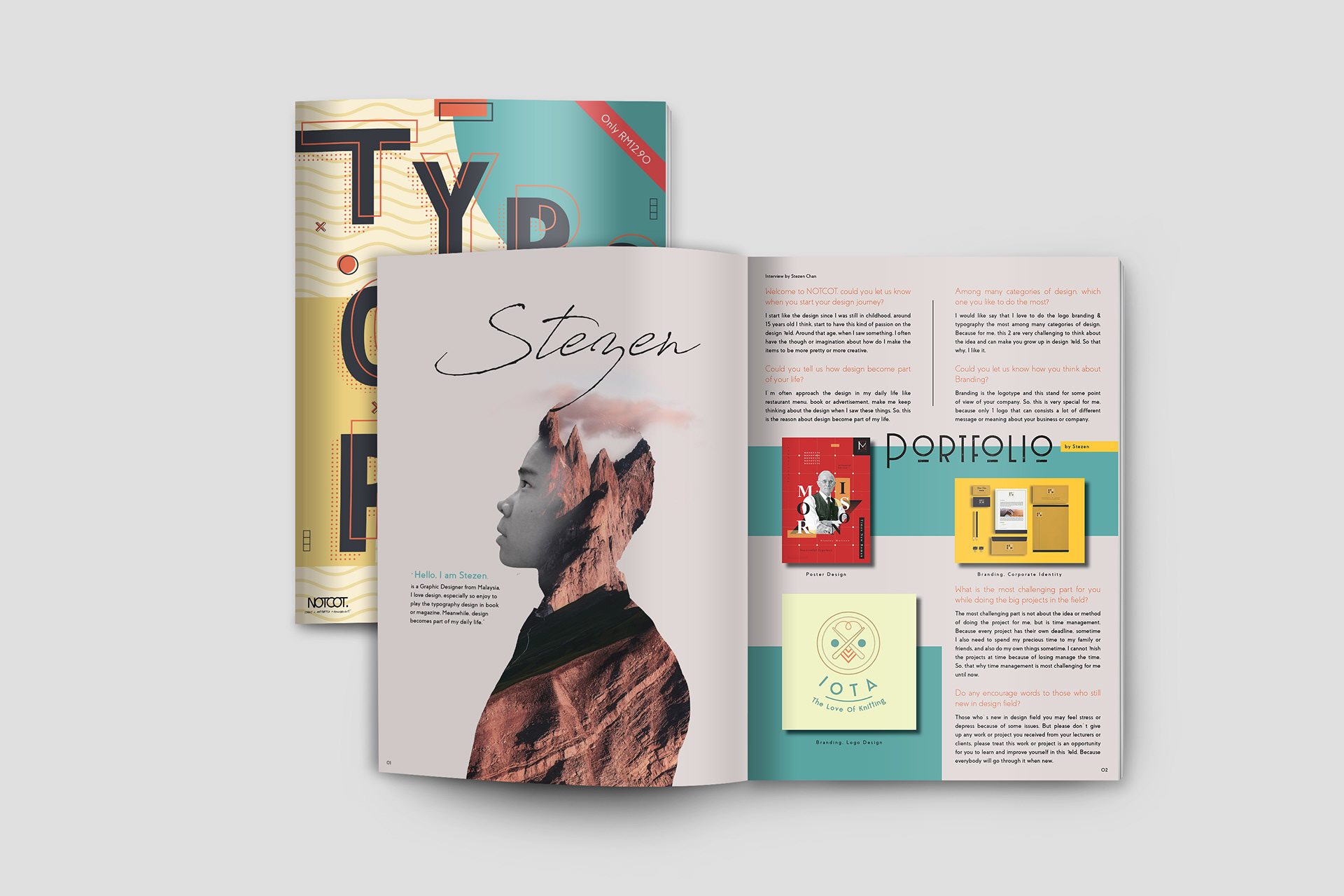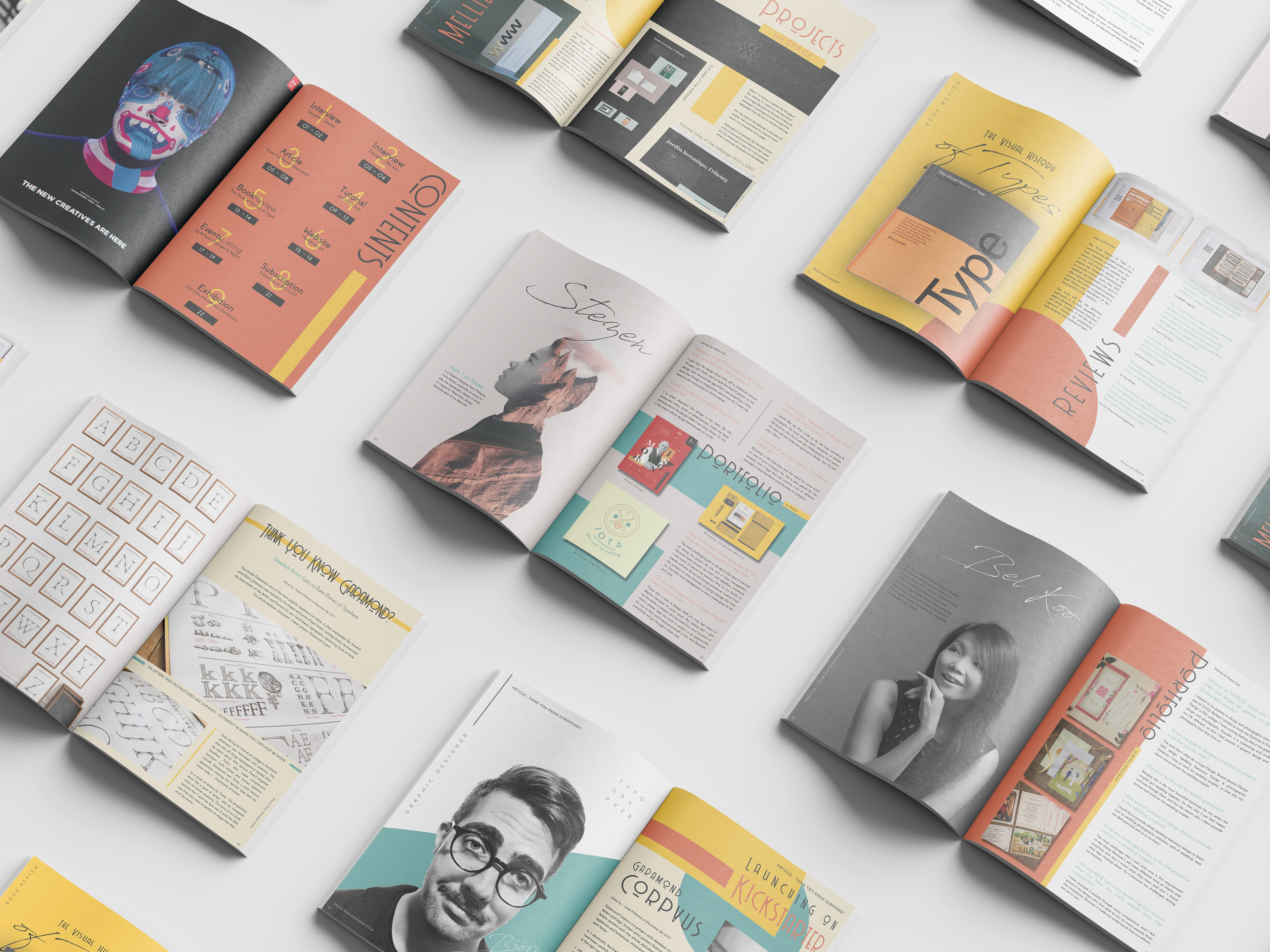
This Notcot Magazine concept project, focused on Typography, demonstrates a strong command of modern editorial and graphic design principles. The execution features a bold, layered cover that immediately signals a vibrant, design-centric publication. Inside, the layout expertly balances striking visual elements—like the compelling "Steagen" double-exposure portrait—with clear, functional content structures (portfolios, interviews, reviews). By utilizing a sophisticated color palette, dynamic hierarchy, and original artistic direction, this project successfully creates a cohesive and professional publication mock-up, highlighting skills in editorial layout, type design, visual hierarchy, and photo editing.